Color can feel like one of those things other people are just good at. You know the type—effortless, always looks sharp, like their clothes were designed to live together in harmony. Meanwhile, you’re stuck wondering if that rust-colored shirt goes with anything other than black jeans.
We get it. Most guys don’t want to become stylists. You want a system. A way to make color work harder for your wardrobe, not complicate it.
This is that system. Built for the guy who travels light, dresses with purpose, and doesn't have time to overthink it.
What’s the Three-Color Rule, and Does It Still Work?
Let's start with a core concept. There’s a simple guideline that still holds up: don’t wear more than three colors in one outfit. It’s not about restriction. It’s about balance. Limiting your outfit to three tones keeps things clean and cohesive. No one wants to look like a walking color wheel.
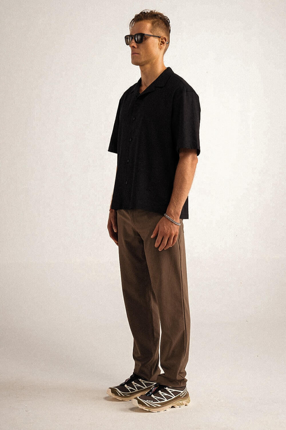
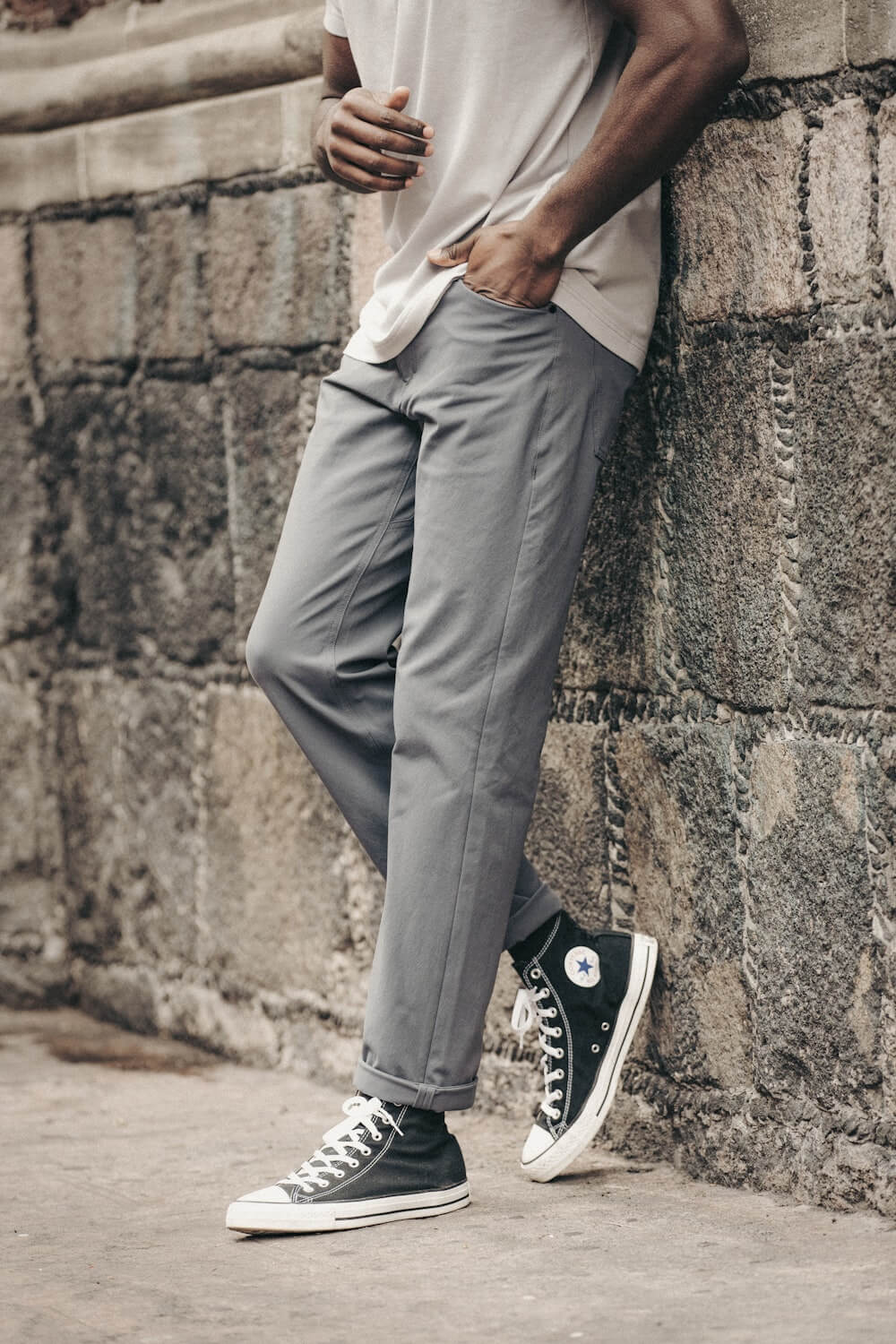
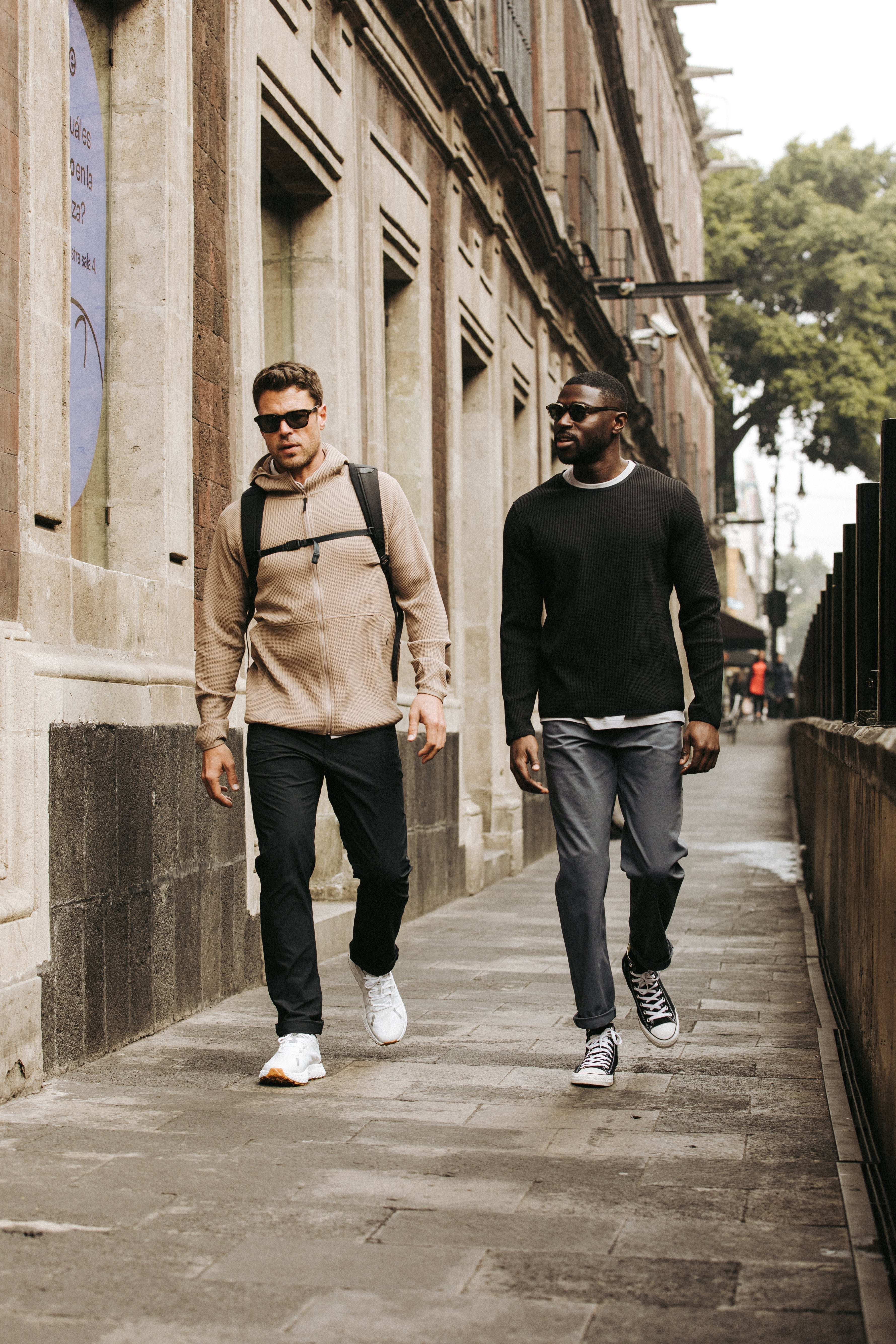
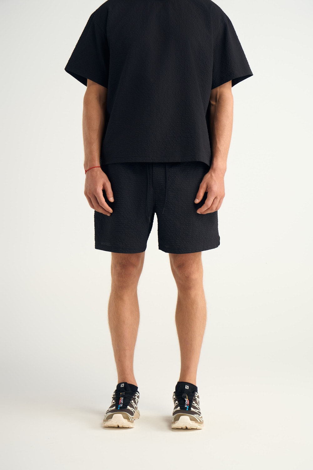
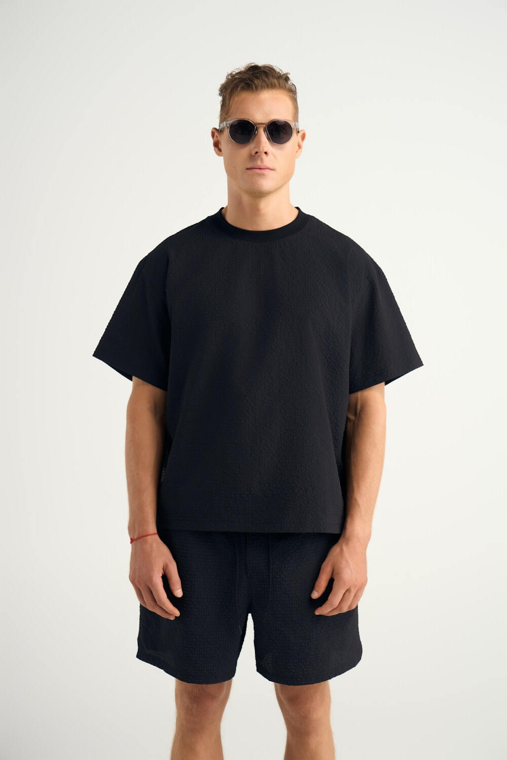
A good three-color outfit usually includes a neutral base, a complementary tone, and one accent or texture twist. For example: navy pants, a white tee, and a sage overshirt. Or charcoal joggers, a cream waffle knit, and black sneakers. Simple, sharp, and well thought out.
This “rule” works especially well for travel or capsule wardrobes, where every piece needs to mix and match. It helps you pack lighter and get dressed faster without sacrificing style.
Once you understand how to balance your palette, you’ll start using color to express confidence, but not just follow a formula. Let’s dive into mastering men’s color combinations.

Start with the Basics: Neutral Color Combos Every Guy Should Know
Neutrals are the unsung heroes of every great wardrobe. They're timeless, adaptable, and always in style. Think of these as your basecamp: Navy, Charcoal, Olive, Beige, Cream, Black, and White. Each one earns its keep in different ways.
Navy
Navy is the Swiss Army knife of menswear. It’s structured, deep, and clean. Works with everything from burgundy to camel, and flatters most skin tones.
Charcoal
Charcoal gives you formality without stiffness. It blends better than pure black in casual settings and looks especially sharp on cooler or medium skin tones.
Olive
Olive has that rugged outdoors feel, but dressed up right, it plays well in city settings too. Works best with neutrals like tan, navy, or grey, and flatters a wide range of complexions.
Beige, Dune or cream
Beige and cream bring warmth and softness. These are go-to options for spring/summer layering or as a lighter contrast in fall fits. Just make sure the fabric is structured so it doesn’t wash you out.
Black
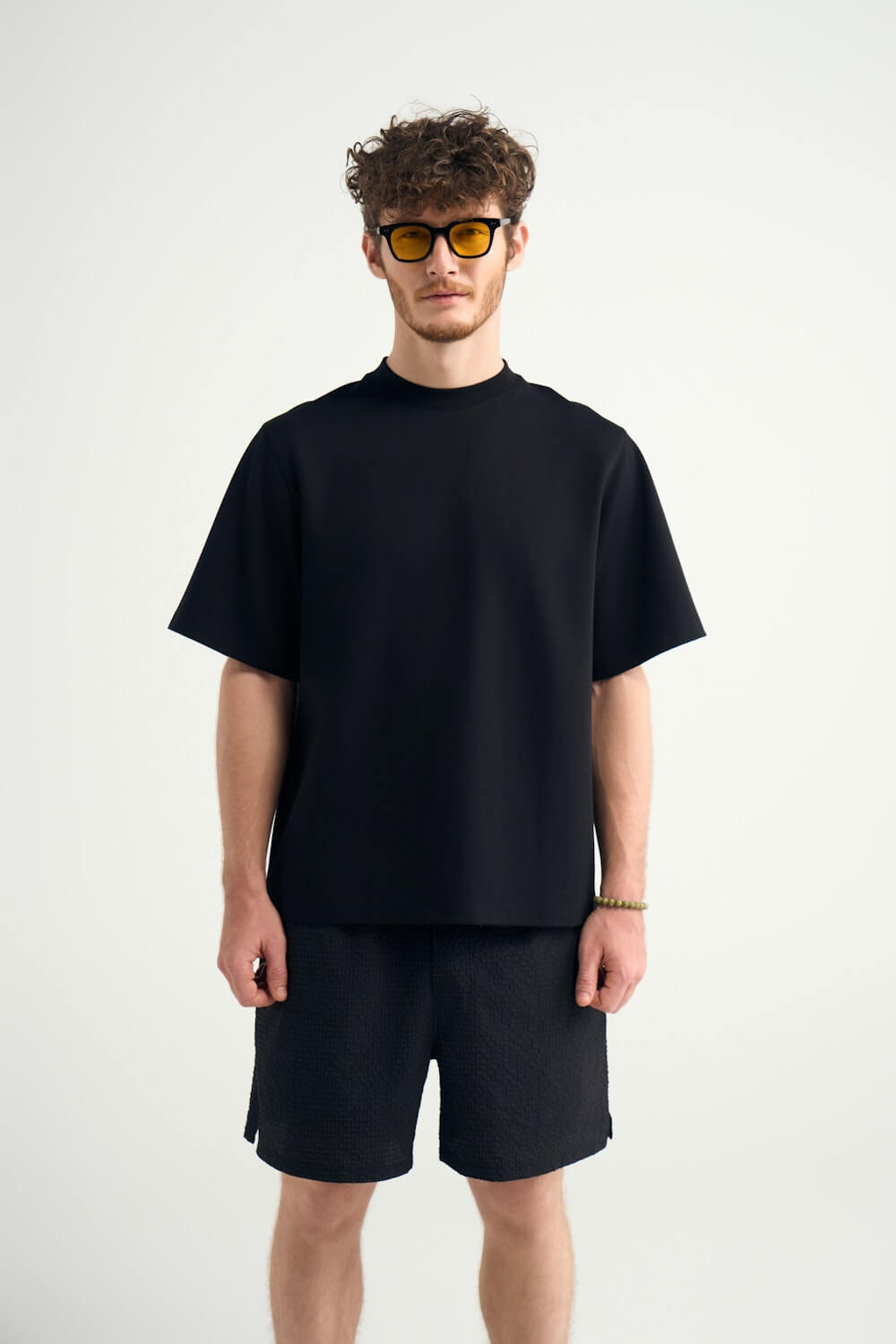
Black is sleek and bold, but can feel too stark if overused. It shines when paired with texture, such as matte fabrics, suede, or wool, and anchors bolder pieces.
White
White is the clean slate. A white tee, button-down, or Henley adds freshness to almost anything. It works on every skin tone, every season, just make sure it’s well-fitting and stain-free.
The power of neutrals isn’t just that they look good alone. It’s how seamlessly they pair with each other. Navy and olive. Cream and charcoal. Beige and black. These combos let you build outfits that feel effortless but intentional, which is exactly what you want, whether you're boarding a flight or grabbing coffee in an unfamiliar city.

Essential Western Rise Neutrals:
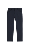
- Evolution Pant in Navy or Dune
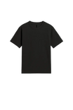
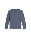
- Limitless Merino Shirt in Smoke Heather
- AirLoft Vest in Blue Grey
- Versa Hat in Charcoal
Add Personality With Intentional Color
Once your neutral game is dialed, color becomes a tool, not a gamble. The key is to reach for shades that add personality without overpowering your look. Earthy, grounded tones like deep burgundy, dusty teal, umber, elm, rust, soft pink, and light blue offer that sweet spot between interesting and wearable.
Burgundy
Burgundy adds depth and richness. It pairs beautifully with navy, charcoal, or tan, and works especially well on guys with medium to dark complexions. Think of it as the grown-up version of red.
Dusty
Dusty teal or muted turquoise has a calming, confident energy. It complements greys, olives, and navy. It looks sharp on both cool and warm undertones, making it surprisingly versatile.
Rust
Rust brings warmth and individuality to your wardrobe. It shines against navy or charcoal and flatters deeper skin tones in particular. It’s bold, but not loud.
Elm
Elm is a quiet flex. Understated and earthy, it looks great on pale to medium skin tones and pairs easily with beige, tan, cream, or black.
Soft pink
Soft pink has come into its own as a confident neutral. When the fabric is right, like merino or cotton, and the fit is clean, it works with olive, grey, or even denim. It’s fresh without trying too hard.
Light blue
Light blue brings an effortless sense of calm and cool. It works across seasons, pairing well with tan, white, navy, or khaki. It’s approachable and relaxed, making it a reliable go-to for both casual and slightly elevated looks.
The key is building around your base neutrals and letting color add personality without overwhelming the look.

Western Rise Brighter Options
- Diversion Pants in Canyon
- Venture Crew in Elm
- Limitless Short Sleeve Shirt in Burgundy
- Limitless Shirt in Light Blue.
Each one brings just enough color to stand out, while pairing effortlessly with your go-to neutrals.
Don’t Just Match Color—Match Texture
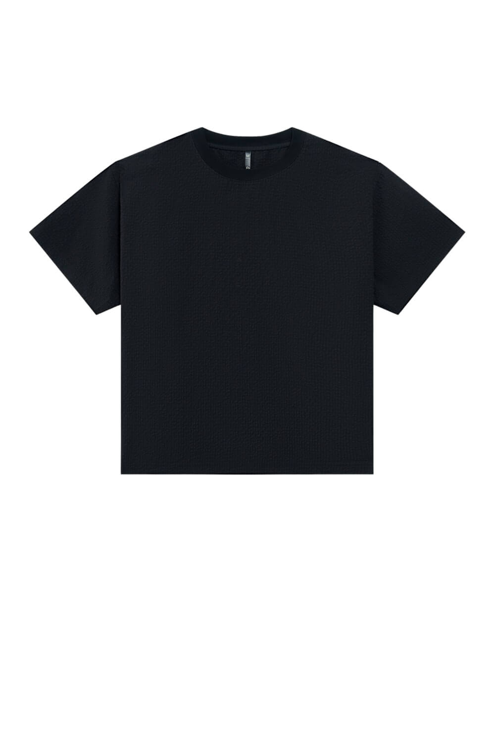
Want to elevate a simple outfit? Mix textures with intention, and match the fit while you’re at it. The same color in two different materials can feel like a completely different outfit. A charcoal merino tee says something very different than a charcoal cotton hoodie.
Waffle knits add depth through their raised weave. They bring a rugged but polished vibe that’s ideal for cooler weather or layering under jackets. Go for slim or athletic cuts to avoid looking bulky.
Brushed cotton softens the look without losing structure. It works great for overshirts or midweight trousers, offering a casual but elevated feel. A straight or tailored fit keeps it looking refined.
Merino wool is sleek, breathable, and wrinkle-resistant, which is ideal for travel. It drapes closer to the body, so it looks sharp in fitted tees, long sleeves, or lightweight sweaters. Perfect for building a base layer that doesn’t feel like one.
Linen has a breezy, relaxed texture that works in warmer climates. It pairs well with both matte and smoother materials like cotton or nylon. Keep the fit relaxed but not sloppy.
Tech blends, like Western Rise’s performance fabrics, often have a smooth, crisp finish. They pair well with textured tops (like waffle or merino) and keep things streamlined when movement matters.
Texture creates contrast, and fit completes the picture. Whether it’s a tailored camp collar shirt or a well-cut jogger, how your clothes fit affects how your colors and textures are perceived. So aim for consistency: if your top is fitted, don’t go overly baggy on the bottom, and vice versa.
Western Rise Texture Pairings to Try
-
A rich, tactile contrast Waffle Sweater in Cream + Smooth Charcoal Pant
-
Breezy, structured Ventra Camp Tee in Olive + Navy Chino
-
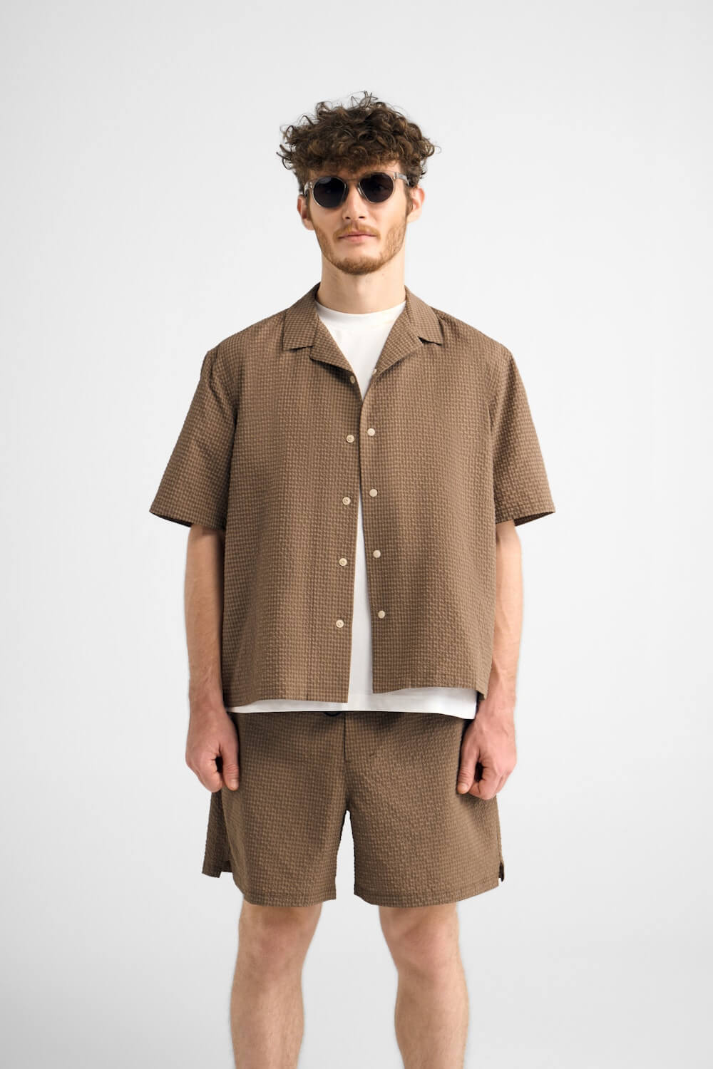
The elevated drape of Linen Camp Collar Shirt + Evolution Shorts
Steal These Foolproof Color Combos
Let’s break it down with a simple, practical approach: shirt and pants color pairings. These combos aren’t just color theory—they're real-world outfit formulas that work whether you're packing for a weekend trip or dressing for an unexpected night out.
| Shirt Color |
Pant Color |
Why It Works |
|
White |
Navy |
Clean, minimal, and always fresh. Ideal for warmer climates or summer layering. |
| Navy | Olive |
Understated but strong. This pairing brings a refined ruggedness, especially good for travel. |
| Light Blue | Tan |
Balanced and relaxed. A go-to combo for spring or laid-back city looks. |
| Charcoal | Olive |
Grounded and masculine. Textured charcoal shirts bring out olive’s natural tones. |
| Cream | Sage |
Soft and modern. Great for transitional weather and lighter-toned looks. |
| Burgundy | Denim |
Stylish without trying too hard. Mid-wash denim makes burgundy pop. |
| Rust | Navy |
Rich contrast. This pairing adds subtle flair to your fit while keeping it grounded. |
| Camel | Burgundy |
Ideal for fall. Warm tones together create a thoughtful, layered aesthetic. |
| Black | Khaki |
High contrast with flexibility. Dress it up with leather loafers or down with sneakers. |
These combos double as a shirt and pants color chart and a minimalist packing checklist. You can swap in layers such as jackets, hoodies, and overshirts around these pairings without throwing off the balance.
Match Colors to Your Appearance
Before you pack or plan outfits, it's worth understanding how color works with your individual appearance. Your skin tone, hair color, and even eye color can subtly influence how a color looks on you versus just how it looks in general.
For lighter skin tones: Soft, cool-toned shades like sage green, dusty blue, cream, and heather gray tend to be most flattering. Avoid colors that are too close to your natural tone (like pale beige), which can wash you out.
For medium/olive skin tones: You have more flexibility. Earthy tones like rust, olive, camel, and navy usually complement well, while rich jewel tones like burgundy and teal add contrast without clashing.
For darker skin tones: Vibrant or saturated colors pop nicely against your skin. Go for bold burgundy, charcoal, true white, and deep blues. Even pastels like blush pink or seafoam can work when paired with darker neutrals.
Choose colors that contrast enough with your complexion to highlight your features, but not so harshly that they overpower you. Once you know what tones flatter your appearance, mixing and matching gets a lot easier, and you’ll naturally lean toward what works best for you.
Color Is Confidence
Great color pairing doesn’t just make you look better. It makes you feel more put-together. That doesn’t mean flashy. It means knowing your palette and using it with purpose.
Swap that basic black tee for something in pine or dusty rose. Use color to express what kind of day you’re having, or the kind of place you’re headed.
Confidence comes when your wardrobe feels like it belongs to you and goes where you go.

Color Matching for Men: Mistakes to Skip If You Want to Look Sharp
Even a good color palette can fall flat if a few simple mistakes sneak in. Here are the most common missteps we see, and how to dodge them:
- Too much color, not enough base. If everything is loud, nothing stands out. Start with neutrals and let one color lead.
- Stacking bold on bold. A rust shirt and burgundy pants? That’s a little loud for most guys. Anchor bold tones with subtle layers.Ignoring fabric and fit. Color can’t rescue bad tailoring or poor texture choices. Prioritize fit that flatters your frame and materials that hold their shape.
- Forgetting versatility. That neon jacket might be fun once, but if you can’t style it three different ways, it probably shouldn’t be in your travel bag.
- Clashing seasons. Some colors are seasonal for a reason. Bright coral with dark flannel? Doesn’t land. Match the weight of your fabrics with the tones you wear.
- Over-accessorizing with contrast. If your base outfit already pops, don’t overdo it with contrasty shoes, socks, or hats. Choose one spotlight moment.
Stay mindful, keep it balanced, and let each piece have its place in the mix. When in doubt, simplify.
Final Thought
You don’t need more clothes. You need smarter ones. A few great color combos. The right textures. Clothes that show up, blend in, and stand out—all at the same time.
At Western Rise, everything we make is built to go wherever life takes you.
So pack light. Layer well. And let color work for you.

